Dashboard Usability Study
A study aimed at making dashboard creation more accessible for beginner users
PROBLEM
Tableau Desktop’s dashboard creation and interaction processes have a steep learning curve and create significant barriers of entry for beginner users.
METHODS
- Interaction Map
- Survey
- Interview
- Moderated Usability Study
- Affinity Map
- Quantitative Metrics
PROPOSED SOLUTION
Based on our findings, we identified 5 key improvements that would make dashboard creation and interaction a more intuitive, efficient, and pleasant experience.
TEAMMATES
- Mari Heo
- Saturnia Bocast
- Britnie Chin
MY RESPONSIBILITIES
- Study scope & design
- Defined participation criteria, user tasks, and problem severity
- Established & validated KPI’s
- Administered pre-/post-test interviews, SUS, and Net Promotor metrics
- Moderated 3 usability tests
- Scored, analyzed, and synthesized qualitative and quantitative data
- Provided actionable insights and specific recommendations
- Presented to Tableau’s Dashboard research and design teams
Background
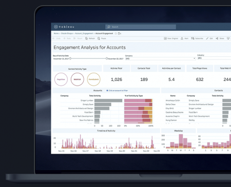
PROBLEM SPACE
Tableau Desktop is a robust but highly specialized platform for creating interactive data visualizations and dashboards. Unfortunately, harnessing these powerful features requires knowledge of data science or significant past experience in visualizing data. This creates problems for beginner users who don’t want to spend hours acclimating to the platform just to create a few visuals or dashboards. As a result, they often opt to use less robust but more accessible applications like Excel or PowerPoint.
APPROACH
We partnered with Tableau Software to conduct a usability study on Tableau Desktop’s dashboard creation and interaction processes. First, we wanted to examine users’ previous experiences with, and impressions of, Tableau and similar applications. Second, we evaluated how easily and effectively beginner users could perform key tasks within the dashboard creation and interaction processes by establishing and validated KPI’s and identifying specific pain points and design concerns. Lastly, we collected user thoughts and impressions of their usability test experience as well as general concerns with the product.
Methods
RECRUITMENT & SCREENING
Participants were recruited from the University of Washington campus and HCDE program. A survey was created on Google Forms in order to screen potential participants. Novice users (no Tableau experience) were screened out of the study because testing novices after training them would only allow them to draw from their onboarding experience rather than past product usage. Intermediate and advanced users were also not included because we wanted to focus on the experience of users who were familiar with Tableau without being proficient in it. Thus, we decided to only focus on ‘beginner users.’
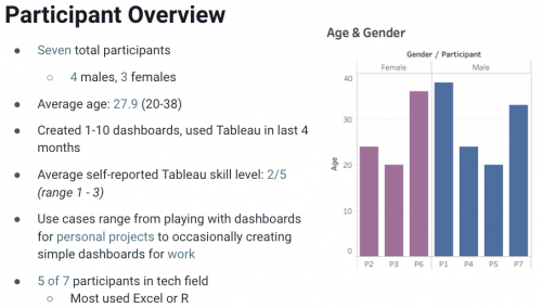
To qualify as a ‘beginner user,’ participants must have: [1] used Tableau in the last 4 months; [2] were able to create at least one visualization, and [3] have created at least one (but no more than ten) dashboards in their life. The rationale was that users’ dashboard creation experience needed to be recent enough for them to remember how to do it. The upper limit of ten dashboards was decided upon to exclude people who were proficient in Tableau. Seven people qualified for the study given these criteria.
PRE-TEST
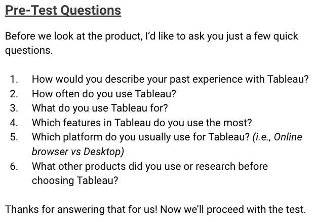
Prior to the usability test, participants were asked about their previous experiences with applications like Tableau and the contexts within which they used them. Their thoughts, feelings, and attitudes toward Tableau were also collected in order to establish user background. Pre-test questions were qualitative and open-ended to allow for richer data. A designated note taker recorded any notable comments, thoughts, or events throughout all phases of the study. Users were recorded with our laptop’s webcam while Quicktime’s screen recording feature was used to record user tasks. Participants were provided with four different types of pre-made visualizations to use when building a dashboard and were assured that the test was meant to evaluate Tableau Desktop’s performance, not theirs.
USABILITY TEST
Participants were presented with a scenario and given a series of 20 small tasks (slide 32, Final Deliverable) related to creating, interacting with, and testing the functionality of a dashboard. Participants were instructed to think aloud as they performed each task. Tableau’s ability to accommodate the user on each task was evaluated by the moderator in terms of pass/fail criteria. To pass, the platform must have allowed the user to complete the task with minimal friction and without the help of the moderator. A repository of post-task questions was available to the moderator if the user seemed to struggle with the task. Help was only provided if the user was stuck on a task that was imperative for the continuation of the test.

POST-TEST
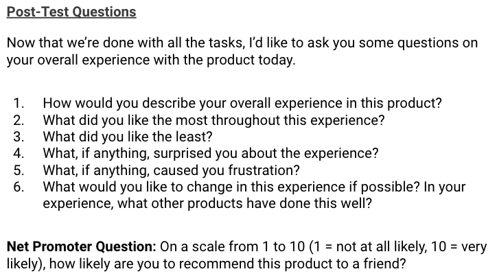
Upon completion of all the tasks, participants were asked about their experience during the test, what they liked/disliked, what they’d change about Tableau, and how their experience compared to similar products they’ve used (see Final Deliverable, slide 37). Participants were then asked the Net Promoter (NP) question before being administered the System Usability Scale (SUS). Both the NP and SUS were included in the study because they are considered industry standards and can serve as a benchmark for future studies. Finally, each participant was given an opportunity to ask questions and provide general feedback.
Analysis
All video footage, notes, and KPI’s were reviewed by all four researchers. Qualitative data were analyzed using Thematic Analysis to help identify key themes and common concerns, while key user quotes were recorded. Quantitative data calculated using descriptive statistical methods to allow for comparisons between users and industry alternatives. Both NP and SUS outcomes were scored using their accepted scoring methods, averaged across all participants, and compared to industry standards.
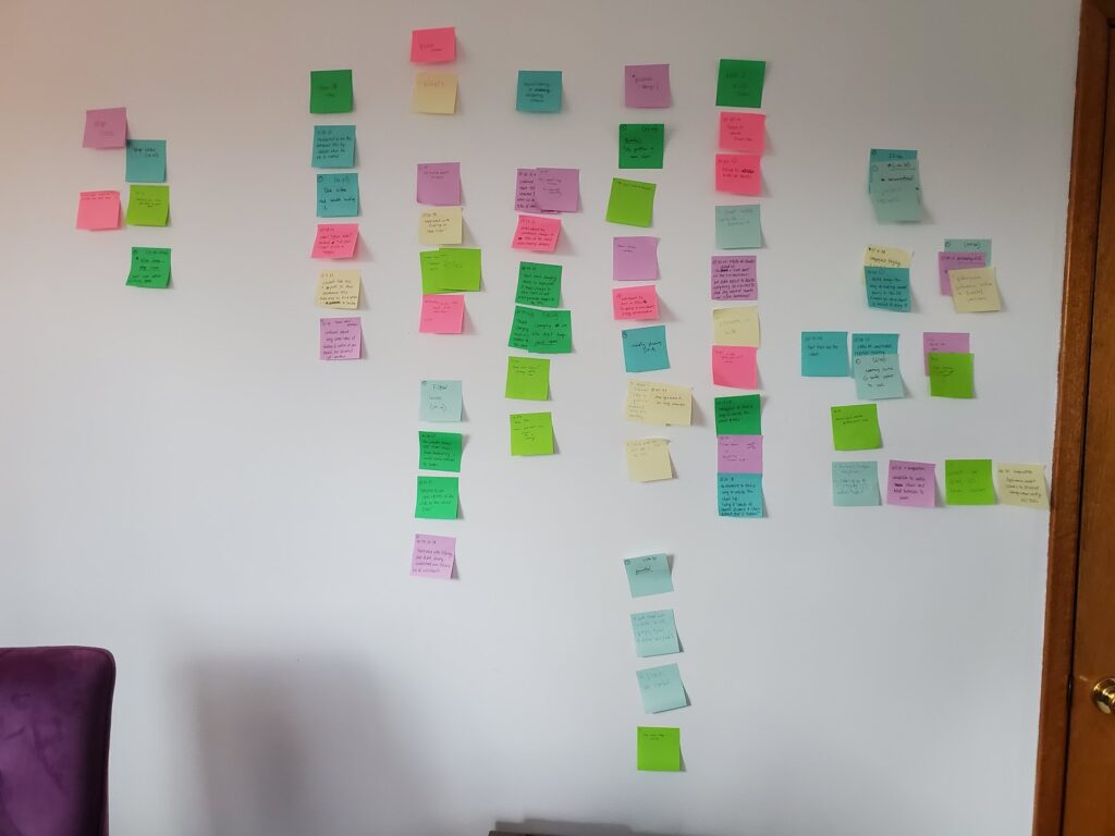
All pre-test, post-task, and post-test data were then synthesized using Affinity Mapping to define problem categories. A highlight video of users’ major pain points was compiled by all researchers to showcase consistent issues that arose across all participants. This was meant to provide stakeholders with rich data of users struggling to use specific features of their product. Finally, a 5-point severity scale was defined and applied to user problems based on the degree to which they compromised user goals (see Final Deliverable, slide 13).
Findings

Almost all participants acknowledged that Tableau is a powerful tool that created “robust” and “aesthetically pleasing” visualizations. However, five of the seven beginner users stated that, if given a choice, they would opt to use Excel or Powerpoint for their projects because they were quicker, simpler solutions that involved less overhead despite their perceived inferiority. Four users also alluded to the fact that Tableau presented them with too many options up front without providing an intuitive interface with quick-start guidance on where their “eyes should go.” Additionally, three users pointed out that feature names were “unconventional” ands proprietary, making them harder to learn.
Specific pain points experienced by at least four out of seven participants can be found on slides 14 – 18 of our Final Deliverable and are summarized below. These insights were designed to be specific and actionable.
- Difficulty finding ‘Show Dashboard Title’ feature, often wondering why it doesn’t appear by default.
- Confusion regarding the titles of Sheets and visualizations. Users expected that Sheet titles would change visualization titles.
- Difficulty filtering by visualizations within the dashboard.
- Trouble navigating through map visualizations. Users felt map visualizations were too complex and got stuck filtering data by state.
- Confusion about what the ‘Hide/Unhide’ feature does, as compared to similar features like removing a visualization from the dashboard.
Recommendations
Based on our findings, we provided Tableau’s Dashboard research and design teams with the following recommendations:
- Naming the dashboard title should be more salient in the toolbar. Additionally, dashboard title should appear by default.
- Improve consistency of naming dashboard visualizations, sheets, and sheet tabs
- Redesign toolbar components to be more intuitive by reducing upfront options and increasing size of feature icons to improve visibility, accessibility, and guidance for the user.
- Rename “Hide” to “Hide Tab” to reduce confusion on what is being hidden
- Improve consistency of naming dashboard visualizations, sheets, and sheet tabs